Nautilus Sjø AS · Bachelor’s project, Kristiania University College · Team of 5 · January to May 2025
Skydd. So young boaters can get home safely.
A safety app that turns the pre-departure risk assessment into something teenagers actually want to complete. I was responsible for the design process and led all 15 user tests.
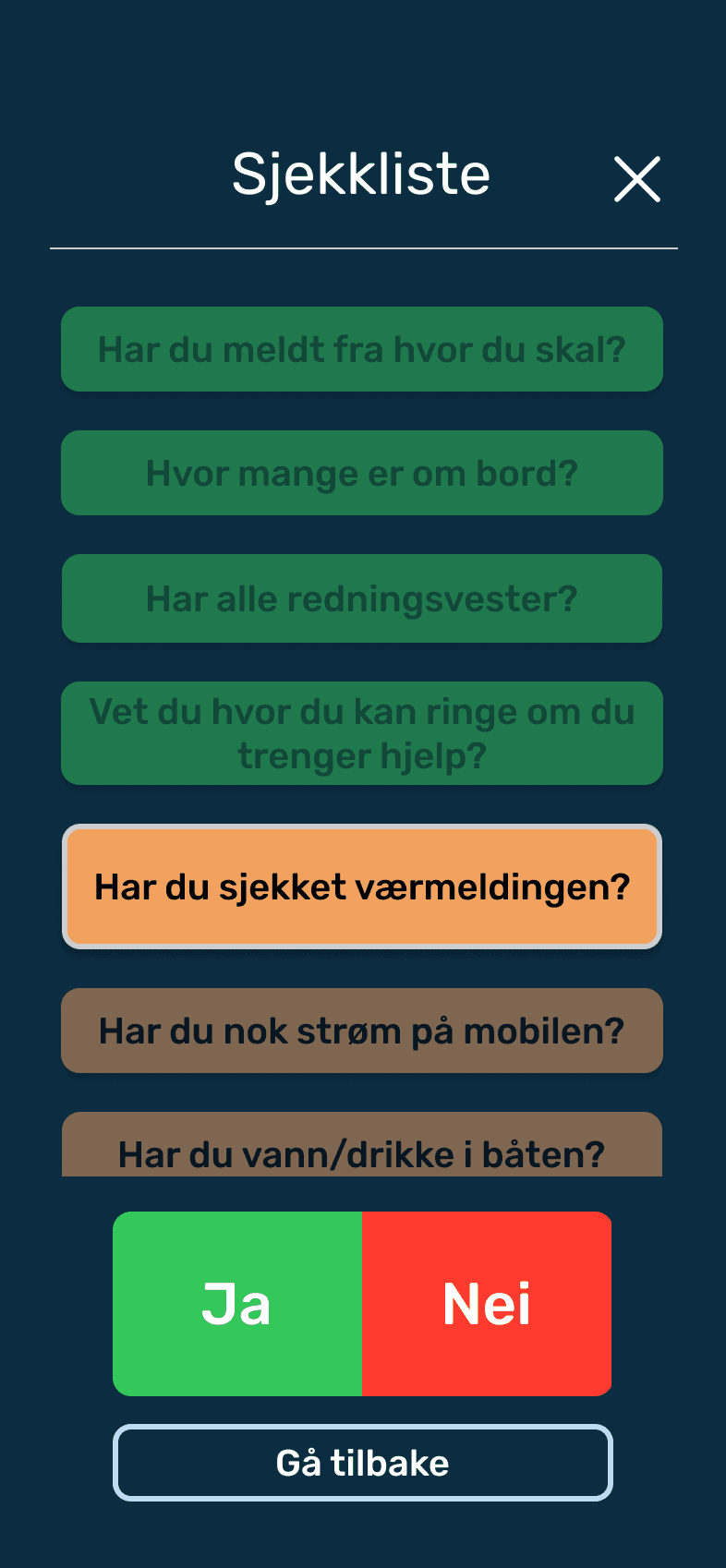
Before departure
The checklist, with traffic lights and progress.
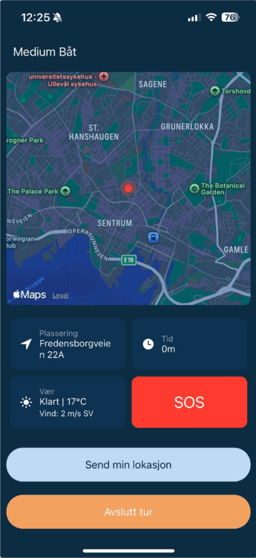
Underway
Live position, weather and SOS, for the parents too.
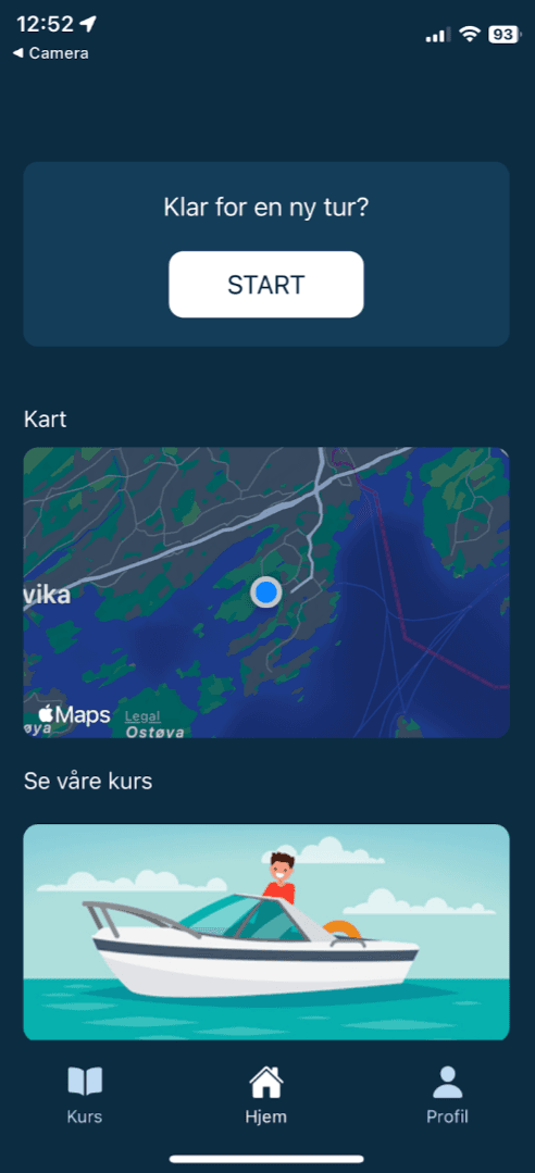
Home
Map, courses and profile in one place.
01The problem
There were 39 deaths at sea in Norway in 2024.
And the numbers are heading in the wrong direction. The Norwegian Maritime Authority has a “zero vision” for deaths at sea. Our client, Nautilus Sjø, wanted to reach a specific group that current tools overlook: young boaters who borrow the family boat. Apps like RS SafeTrx focus on rescue after an accident has already occurred. There’s nothing on the market that helps a 16-year-old avoid the accident in the first place, or gives parents who hand over the keys a reason to relax.
The mission: a mobile app where young boaters conduct a risk assessment before setting out, with notifications sent to parents. The primary target group is ages 12 to 20, with parents as the secondary group.
Who we designed for
Henrik, 19
Young boater
Has just passed his boating license exam and received a boat from his family for his birthday. Knows basic boating safety, but may underestimate risks.
Needs: A pre-departure check that’s quick enough to actually be done, and reassuring enough for parents to relax.
Anette, 47
Parent
Henrik’s mother. Doesn’t drive a boat herself and has little knowledge of boating. Gets anxious every time the boat leaves the dock.
Needs: To know that the checklist has been completed, and where the boat is if something happens.
Pernille, 12
Young boater
Drives with friends; has a 9.9-horsepower motor used for short distances.
Needs: Help with the checklist, the risks, and what to do if something unexpected happens.
Per-Ivar, 43
Parent
Pernille’s father. Has a keen interest in boats and boating. Drives a Goldfish 28 Bullet.
Needs: To give Pernille freedom on the water, with peace of mind through safety checks, alerts and oversight.
02My role
Design and testing, from FigJam to the last test round
In a team of five (three interaction designers, two developers) I was responsible for design and testing: concept development in FigJam, wireframes, the design system, the high-fidelity prototype, and the planning, execution and analysis of every user test.
- Team
- 3interaction designers2developers
- Tools
- FigmaFigJamScrumwise
03The process
Including what went wrong
We adopted a “design-first” principle early on: nothing would be built until it had been tested on people from the target groups.
- 01
Research
Statistics, competitors, target group
- 02
Concept
FigJam, personas, flows
- 03
Prototype
Wireframes → high fidelity
- 04
Test ×2
8 + 7 participants
- 05
Build
React Native + Firebase
Round one · unstructured
Round one taught us about our users, and at least as much about our method.
I conducted the wireframe test with 8 participants and deliberately kept it unstructured. It revealed real problems: users ignored the emergency contacts within the app because they trusted their phone’s own contact list more, several flows ended in dead ends without back buttons, and half of the testers misunderstood the e-learning module. But the loose format also gave us inconsistent data from session to session.
Round two · structured
So I changed the method.
For round two I wrote a structured protocol: ten fixed tasks and ten fixed questions, in the same order for everyone. The results were comparable across all seven sessions, and we could rank findings by frequency and severity instead of discussing anecdotes. All the issues from round one were confirmed resolved.
Round one
Wireframe test · 8 participants
Round two
Prototype test · 7 participants
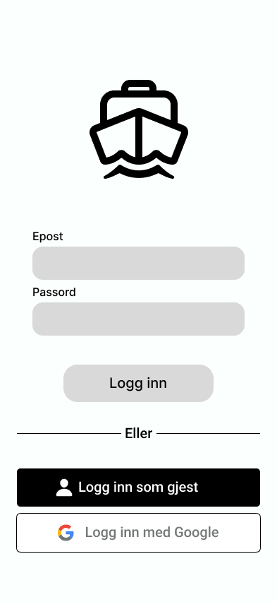
From wireframe to finished screen
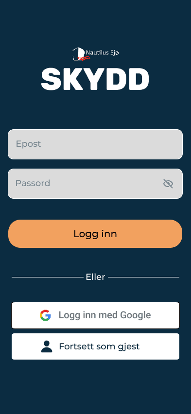
Fewer fields and one clear primary button. The login was where most people stalled in round one.
04The design
Playful, but never at the expense of clarity
The safety feedback uses traffic light colors, with a separate mode for color-blind users and text for each status, so that no information relies solely on color. Rubik for readability on small screens. A dark maritime blue base, calm enough to inspire trust. The gamification elements followed the Octalysis framework: a progress indicator and small animations for each completed step. Duolingo-style mechanics, aimed at life jackets.
What the testers said
The app felt fun, and the safety check felt less like a chore. That was exactly what we were after.
Choices I stand by
Prevention over rescue.
We positioned Skydd in the one gap the market had left open: before departure, not after a crisis.
Structure over spontaneity in testing.
We lost some openness and gained data we could act on. But the freedom in round one captured the insight about the contact list, something a script might have overlooked.
Removing our own feature.
Emergency contacts in the app obviously felt useful to us. Users disagreed, so the feature went.
Personality in a safety product.
Friendly language and playful animation, wrapped around strict contrast requirements. User-friendly and distinctive are not opposites.
05The result
Delivered, approved, and 7 of 7 would use it
A working cross-platform app (React Native and Firebase), delivered and formally approved by Nautilus Sjø against the requirements set at the start of the project. All seven testers in the final round said they would use the app if it were launched.
“Well-coordinated, disciplined and professional”
What I would have done differently
01Test accessibility on real users
We built a mode for color-blind users but never tested it on color-blind users. Guidelines are not the same as verification.
02Family sharing from day one
Sharing boats and contacts was the most important recommendation for version two. It should have been in version one.