Interaction Design, Kristiania University College · Team of 4 · Insight, personas and prototype · Fall 2023
Innafor. A drinking log without the judgment.
An app that gives people insight into their own alcohol consumption without making them feel judged for it. 398 survey responses became four target groups and eight personas that steered the rest of the project, and in the end we chose character over safety, on purpose.
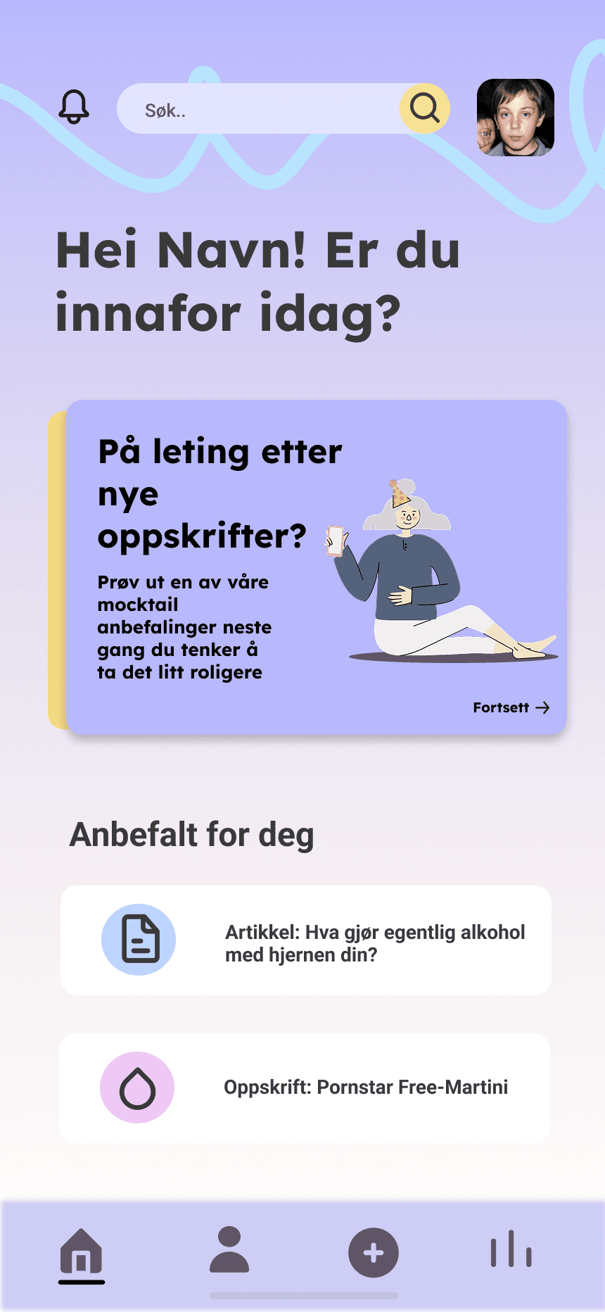
The main feed
Log a unit with one tap: large tap targets, even at one in the morning.
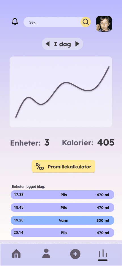
Personal statistics
The most requested feature: 38% asked for exactly this.
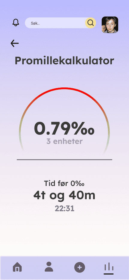
The BAC calculator
Estimates when you can legally drive again. The idea came from the open text field.
01The problem
94.5% drink. Very few keep track.
In our survey, 94.5% said they drink alcohol, and very few had a real sense of how much. The existing apps didn’t help. The service Drikkevett felt judgmental, and Reframe is American, built for a different drinking culture.
We wanted to make a tool that speaks to you like a friend who happens to be good with numbers: honest, useful, never judgmental.
02My role
Insight, personas and the prototype
My team and I designed the survey and analyzed the results, built personas based on the data, mapped out the flow and interactions in the prototype, and designed the login, profile, statistics, and navigation. We designed the concept and the main feed together as a group.
- Team
- 4students
- Tools
- FigmaGoogle FormsMiro
03Insights first
We ran the survey for numbers. The most valuable thing was words.
We sent out a survey and got 398 responses from people between 18 and over 80. The findings shaped everything that came after. The open text field gave us the best ideas in the whole project, including the BAC calculator that estimates when you can legally drive again.
What actually limits people’s drinking
What people wanted most in the app
From data to people · four groups, eight personas
Four groups that mirror how Norwegians actually drink: everyday drinkers, heavy drinkers, the health-conscious and new drinkers. Two personas per group, so no one was reduced to a single stereotype. When we discussed features later, it was usually the personas that decided.
Berit, 53
Everyday drinker
Full-time job, grown children, loves social gatherings. Small amounts on weekdays, but vacations and parties are when she lets her guard down.
Needs: Keeping track during those specific occasions.
Mathias, 21
Big nights out
A student with a busy social calendar and many drinking occasions in a typical week.
Needs: A nudge when the night is slipping past his own limit.
Ragnhild, 32
Health-conscious
A doctoral student who drinks rarely and keeps a close eye on her own health.
Needs: To see alcohol alongside her other health data.
Jakob, 19
New drinker
In his first year of military service, with little partying experience and a tight budget.
Needs: To keep costs and consumption under control while staying safe.
04The design
Design for intoxicated users, and the gray one or the purple one
My favorite part of the project. Our users aren’t always sober when they use the app, which makes universal design the core requirement rather than a checklist. Accessibility guidelines usually focus on permanent disabilities, but designing for a temporary and potentially severe impairment made the entire app better for everyone.
The gray one or the purple one
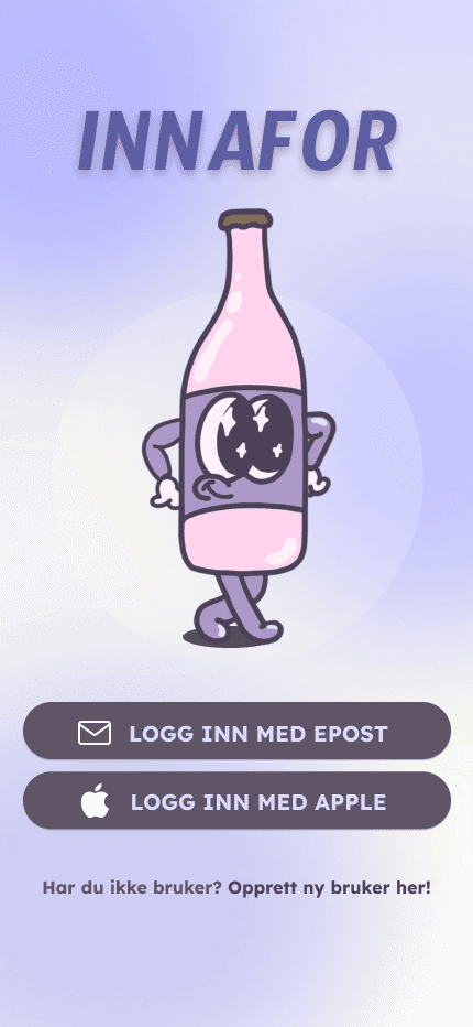
The safe gray direction against the one we chose: colorful purple with a friendly mascot. The category was full of apps that felt clinical; personality was what was missing.
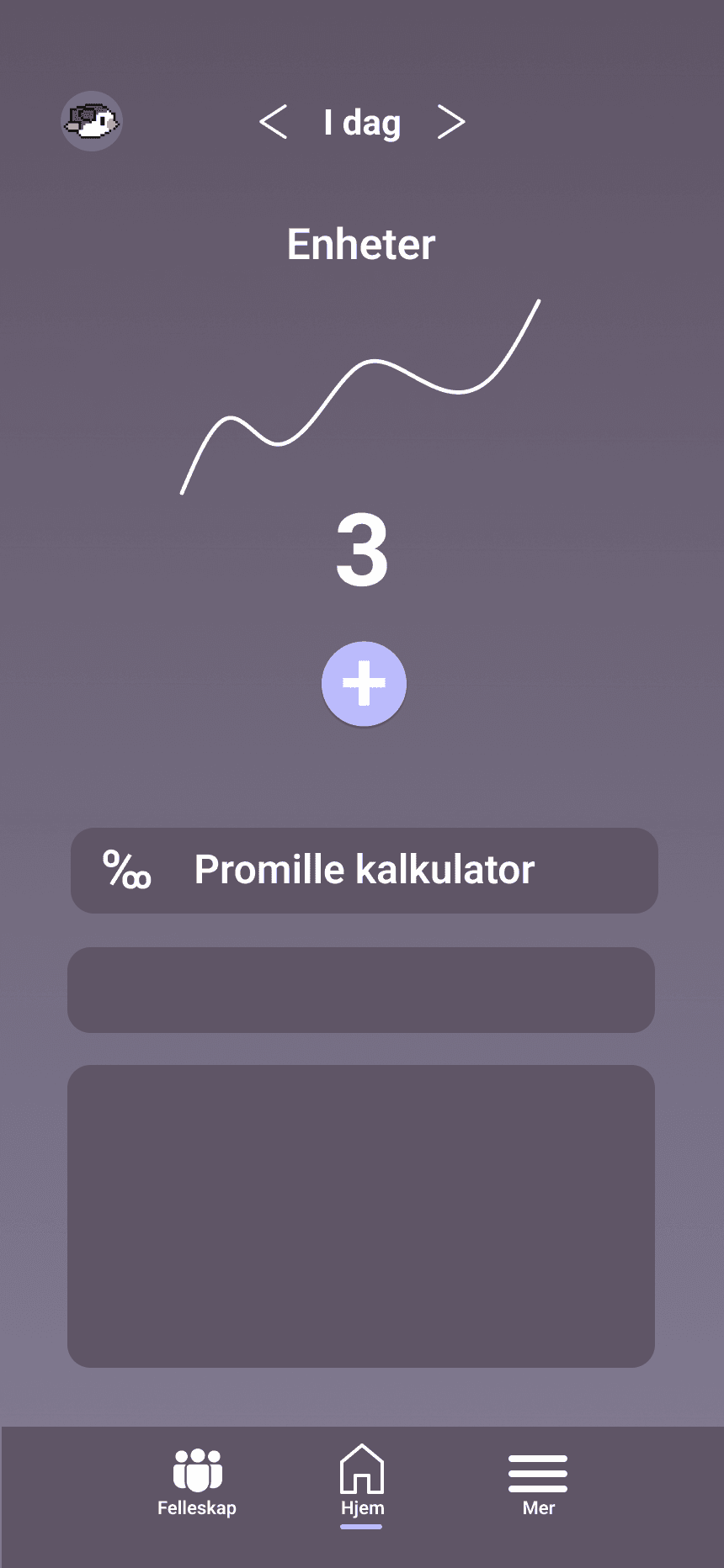
The category was full of apps that felt clinical or patronizing, and personality was exactly what was missing. Distinctiveness was a strategic choice here, not a stylistic one. This is the project I point to when I say that user-friendly and playful aren’t opposites.
05Testing
Half-finished prototypes give half-finished answers
We tested the prototype in four moderated sessions, one user per target group, on a phone with Figma installed. People found their way with the navigation bar, understood how to log a unit and switch the statistics view, and praised the login flow and the look. The vaguer feedback taught us something too: we tested before the prototype was completely finished.
- 01
Survey
398 responses, Google Forms
- 02
Personas
4 groups, 8 personas
- 03
Concept
A friend who is good with numbers
- 04
Prototype
Gray or purple → purple
- 05
Test
4 sessions, one per group
What I would have done differently
01Multiple choice where it belonged
One survey question was single choice and should have been multiple choice. We saw the error in the data.
02Test the finished prototype
We tested an early version. Half-finished prototypes give half-finished answers.
03More of the words into the design
The open text field gave the best ideas. I would have pushed even more of them in.