Exam, Kristiania University College · Team of 4 · Lead designer · Fall 2024
Eir. Warm before it could be useful.
A companion app for young people struggling with their mental health, for the space between sessions, not instead of them. Our test users overruled us time and again, and the design got better every time. Warmth was treated as a functional requirement, not decoration.
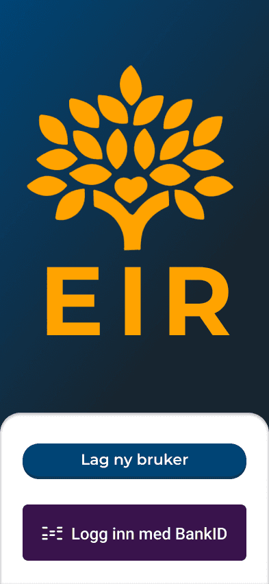
In with BankID
The only way in. The users demanded it.
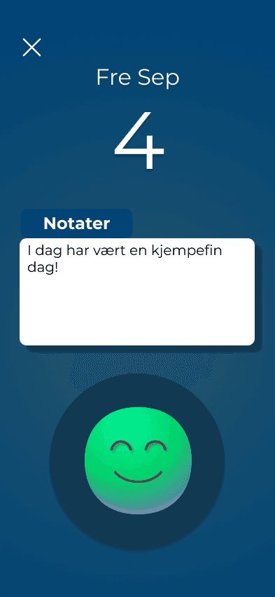
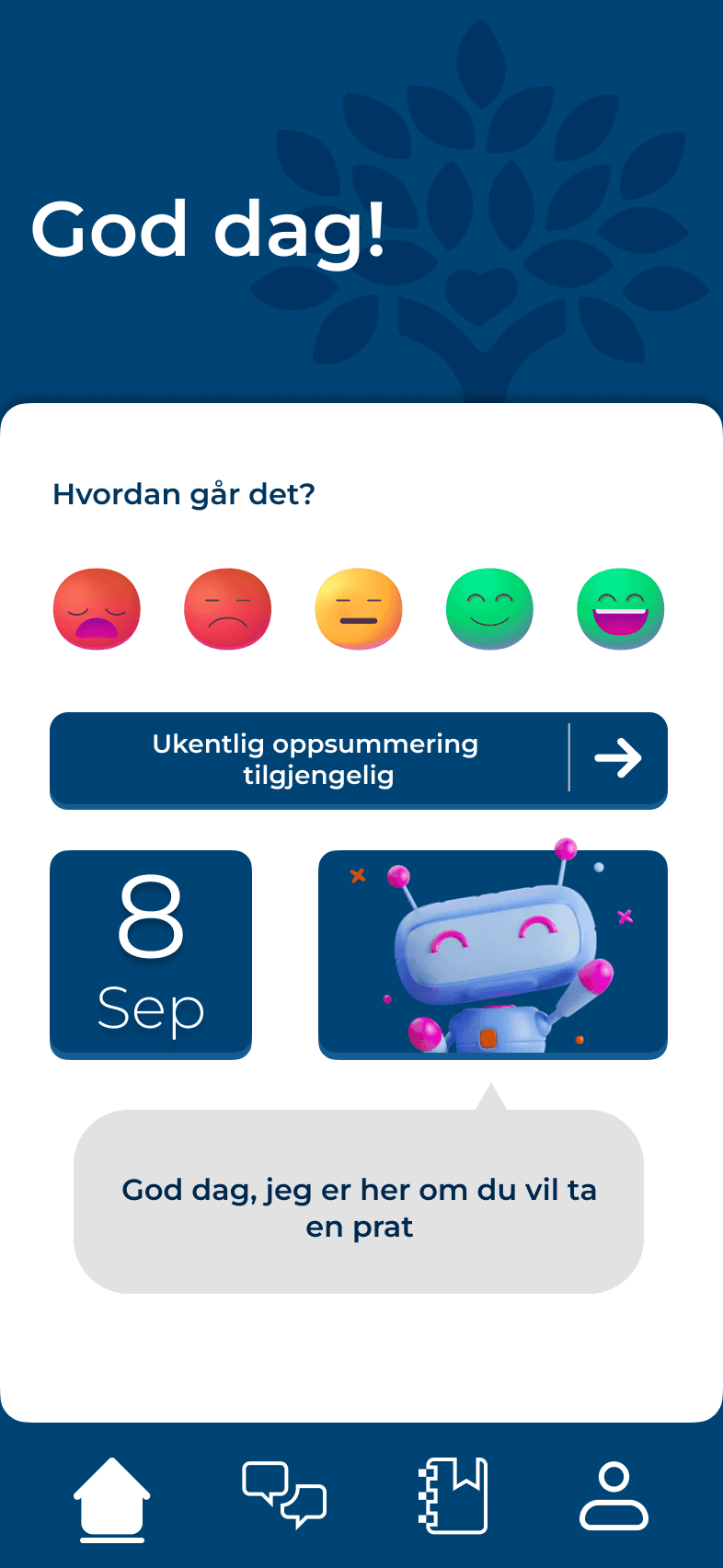
Log your day
One of five faces, and a short entry if you want.

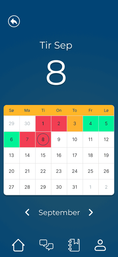
See your patterns
The overview as a path through the week, not a wall of graphs.
01The problem
The space between sessions
Mental health issues are on the rise, especially among young people, and standard services aren’t keeping up. The waitlists are long, and many who are struggling can’t put into words what’s wrong when they finally sit down with a professional.
We wanted to design for the space between sessions. Not a substitute for treatment, but a companion: log how you’re feeling in seconds, see your own patterns over time, and give the psychologist the context you couldn’t articulate yourself, if you want to. We named it Eir, after the Norse goddess of protection, mercy and healing.
The concept · the entire core loop is one tap
Good. Choose one of five faces for the day, and write a short entry if you want. Everything else builds on that.
02My role
Lead designer, from wireframe to finished prototype
I was the lead designer on a team of four. I was responsible for the design direction and for taking the app from wireframe to a finished prototype in Figma. Concept development and testing we did together as a group: 12 tasks, 8 follow-up questions, mostly in people’s homes.
- Team
- 4students, me as lead designer
- Tools
- FigmaMiro
03The process
And what the users overruled us on
We tested the wireframe on 8 people in October (10 were planned; illness took two). The most important finding was also the most painful: the flow for a new journal entry, the very heart of the app, was the feature that tested worst. If logging feels difficult, the app is worthless, so the entire flow was rebuilt into one clear path.
- 01
Research
Waitlists, young people, the space between sessions
- 02
Concept
Core loop: one tap
- 03
Wireframe
Every flow in Figma
- 04
Test
8 sessions, 12 tasks
- 05
Redesign
Prototype + design system
Wireframe test
8 participants, in their own homes
The users changed more than that
From wireframe to finished screen
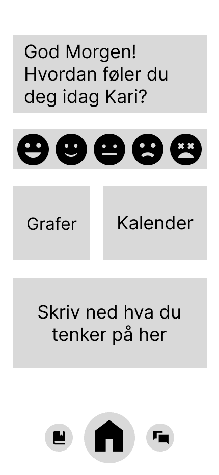
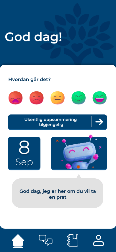
The wireframe had three boxes that all seemed to start an entry. 5 of 8 struggled with it. Now: one clear path, the faces moved into the journal flow.
04Warmth as a requirement
The contrast failure was the best thing that happened to the design
Halfway through, our first color palette failed the contrast checks. Fixing the accessibility issues forced a complete rethink, and the app ended up looking better for it: a calm blue with warm yellow and orange, Montserrat for readability, rounded shapes and soft shadows throughout, and a small sun made of gradients on the profile page. The five faces communicate through both color and expression, so they work for color-blind users too.
None of this is decoration. The whole bet of the app is that someone having a bad day will open it anyway. Every soft corner does a functional job.
Choices I stand by
Letting 8 users override 4 designers.
Only BankID, the profile page, and the name change. Every time we lost a discussion against the test data, the product won.
Treating tone as a function.
The name change from “statistics” and the overview as a journey came directly from how the target audience talked about their own mental health.
Not redesigning based on doubt.
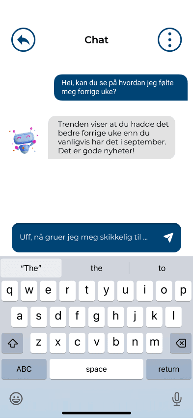
The skepticism toward the AI chat arose without any concrete design problem. We isolated the variable and postponed the decision rather than overhauling everything.
Letting accessibility guide the aesthetics.
The contrast issue was the best thing that happened to the visual design.
05The result
Ready for the next test round
A finished interactive prototype and a design system, ready for the next round of testing. 7 of 8 testers said they would use the app if we fixed what they had pointed out, and we fixed it.

Eir, after the Norse goddess of protection, mercy and healing.
What we would have done differently
01Test the redesign on a fresh group
The redesigned prototype should have met new testers before any development, not just the eight who already knew the wireframe.
02Richer dummy content earlier
Several testers found it easier to judge the app when it looked and felt real. Gray boxes get gray answers.